 |
|
|||||||
 |
To see a step by step pictorial of how this room was created, click on picture or here. Thanks to Joanie Valenti |
  |
..The Rockford Rescue Mission ... turned out beautiful. This was a philanthropic project done to benefit a rescue mission, who were "absolutely thrilled." You can see from the small picture the scope of the project. |
  |
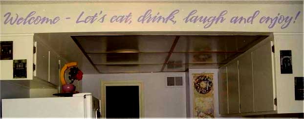
Dawn is a hobbyist who wanted to do lettering that would fit into a free form ribbon painted previously by a mural artist. We were able to match the stencils perfectly. On top is is the picture she sent us for reference, and under that layout sample we returned. On bottom is the finished room. Click on photo for enlarged view. For a step by step overview of how this was done on a similar project, click here. |
"...I was so happy to receive my stencils on Friday! They came out great and worked well with very little positioning work required. We were able to finish this entire project in just a couple of hours and I am very pleased with the results. Thank you so much for getting these to me so quickly...As it turns out, I will be going to the hospital in the morning to have my baby. It is great that I got these before the weekend and was able to finish the project first...Given that I had the banner painted prior to submitting my stencil request, I think this was an exceptionally difficult test for the "Say What?" program. I am very impressed with the results and will definitely use it again and recommend it to others. I can't imagine how many hours this saved over conventional stenciling methods. It has honestly been a pleasure to work on this project with you. It is rare for a business to exceed expectations but you have certainly done that. Thanks for everything..." -Dawn Olstad |
|
Anthony Lane, Master Violin Maker, has been using our stencils to personalize his beautiful hand crafted violins and violas (which are starting priced at over $15,000!) These two use alternating gold and copper leafing. Visit his website at laneviolins.com |
 Photos were taken before final finishing work.. Photos were taken before final finishing work.. |
 |
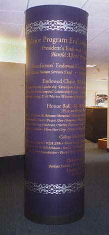 |
This was a project done for a muti-million dollar charitable foundation building.. Although more involved than most home projects, it shows the detail you can get with the lettering. In fact, it would be difficult to get this effect almost any other way!! Click here to see the whole project.
Thanks to: |
Thanks for your wonderful designs. My clients love them. Thanks also for being so easy to work with. -Karen BoleaKaren does beautiful custom work in the Sewickly PA area. This was for a commercial project. Email her at karenbo44@hotmail. Font used: Blackletter |
|

|
Ly'nne did a series of banners on fabric for a client- some nice work. These work fine on cloth. Use a fabric medium or paint though if you want permanence.Thanks to: |
Thank you for making such a high quality product. Though huge, the stencil went up easily, it stuck to my weathered rough-cut oak surface,and the lettering looks just perfect. Your instructions were easy and clear and I followed them to the letter, using the dry-brush stippling method on the rough surface...--I can't believe the whole thing took me just two hours. Thanks again and you are at the top of my list for stencils.- Robert Phillips
|
|

 |
|
The ever-busy Joanie Valenti submitted these special projects (see more of her work on page 1) She's getting into some real creative uses. The bi-plane was inspired by a bed-sheet pattern. Fonts: , Myriad, avialable by request, Arial |
| ...Wanted to take a quick moment to thank you for your help & guidance in producing the "Horse" stencil. All went well and I am thrilled with the results... All Best, Julie Dexter, Gold Leaf Design, Guffey CO. Email her at kingdex@earthlink.net The distinctive signature was scanned, enlarged, and cut as a stencil also. Please contact us for rates. |
.jpg) Font used: Viner Font used: Viner |
 Font used: Chancery |
...I wanted to show you how well this stencil turned out... thanks! I couldn't believe how easy it was to do and how quickly I completed the project. I will be ordering another stencil (this time for MY house) sometime soon. Thanks again and Merry Christmas! Jennifer Allwood Kansas City, MO JAllwood@birch.com |
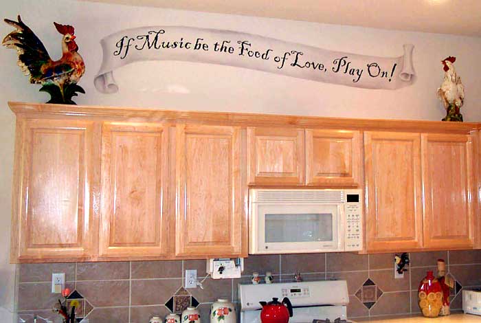 |
Sheri Hoeger painted the banner to match the curve of the text, which was set up with this in mind. The porcelain chickens were supplied by the client. Font used: Black Adder. Available by special request. |
 Font used: Signet |
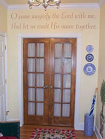
...Here's photos of my finished bathroom... As you can see, I already had a very beautiful "mural" border on the wall (available from www.4walls.com) but I just knew these quotes would be the perfect finish to the room. I just stand there and look at them and can't believe I did it myself. It looks SO expensive and "designer." Everyone just raves. Thank you so much... Katie Bowen |
| The letters are great. They are easy to use and I'm looking forward to more projects. Thank you! Rita Ward, Eden Prairie, Mn Email her at info@fantasticfaux.com | |
 |
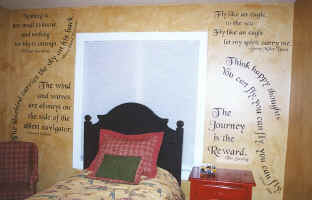
 ... all who are interested in lettering...This job was for 3 full walls of lettering, plus 2 words on either side of the window. I sent the specs on the room, an idea of what I wanted and needed... then faxed back the layout to me, as well as .. fonts that I could choose from... At this point, my work was done till the stencil arrived! That is the beauty of this. I really do not like cutting letters out...and, since my math skills leave a lot to be desired (that's why I paint!) having help in determining placement ahead of time really helped. I believe it saved me close to a full days work!...very easy to work with. I stenciled the whole poem around the room in under 3 hours. The client loved it!! Joni Baker "Northwest Stencil and Design" ... all who are interested in lettering...This job was for 3 full walls of lettering, plus 2 words on either side of the window. I sent the specs on the room, an idea of what I wanted and needed... then faxed back the layout to me, as well as .. fonts that I could choose from... At this point, my work was done till the stencil arrived! That is the beauty of this. I really do not like cutting letters out...and, since my math skills leave a lot to be desired (that's why I paint!) having help in determining placement ahead of time really helped. I believe it saved me close to a full days work!...very easy to work with. I stenciled the whole poem around the room in under 3 hours. The client loved it!! Joni Baker "Northwest Stencil and Design" Joni is a professional stencil artist from Lacey, WA Email: wallart@home.com Font used: kids |
 |
My custom lettering project turned out great! The client is thrilled, and it surpassed their expectations. Thank you, again for your fine product! Julie Dexter |
 |
 |
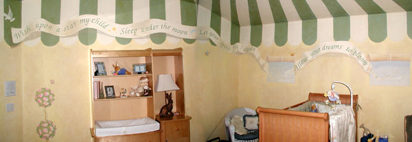
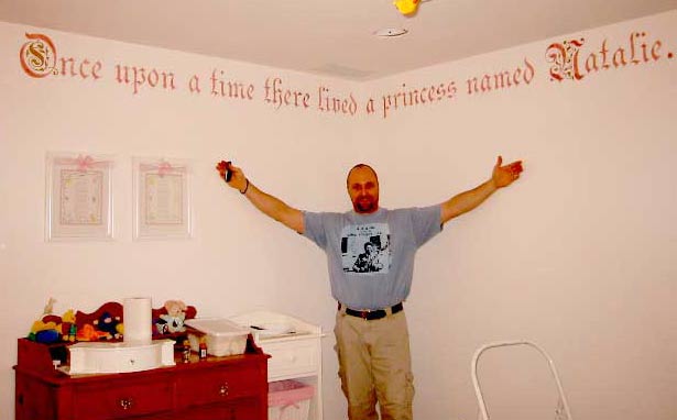
Just wanted to send some pictures of the nursery I did for my daughter. This is the third large project I have done using your stencils. I feel your products are by far the best out there. The art and detail of the stencils make them easy... Again thanks for the great products....Jack Bennett Also used 728 Standing Bunny Font used: Celebration. |
 Font: Dauphin Font: Dauphin |
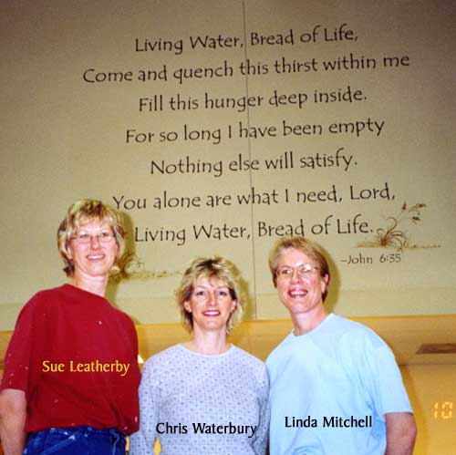
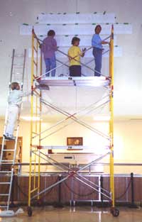
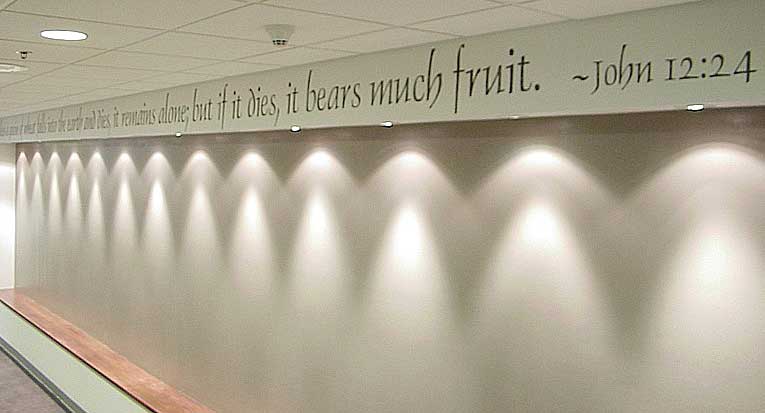
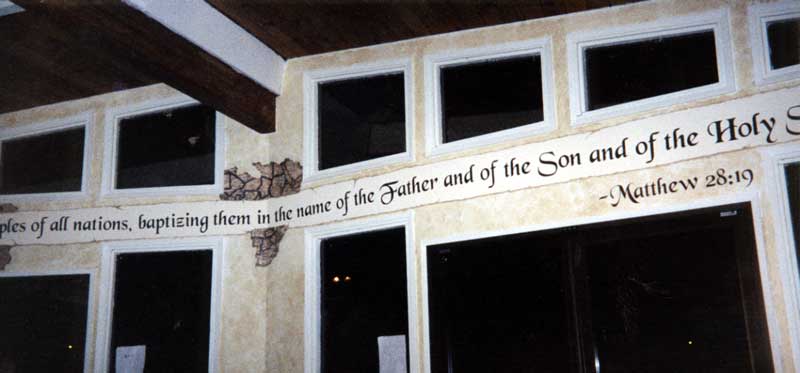
Dear staff at the Mad Stencilist, Thank you so much for helping us accomplish this beautiful project. I have included a picture that shows you how it turned out. With your helpful assistance and excellent service, we were able to easily stencil the Bible verse on this long wall. We plan to place the history of our publishing company (in black & white photos) on the wall beneath the stenciling. Blessings, Peggy Wright, Harvest House Publishers |
 |
Wrapping other designs around the lettering is easy if we cut you an extra set of letter shapes. After you stencil, apply the extra letter shapes over the painted letters, then you don't have to worry about getting paint on your finished words. Painted by Sheri Hoeger. Font: Highland Text |
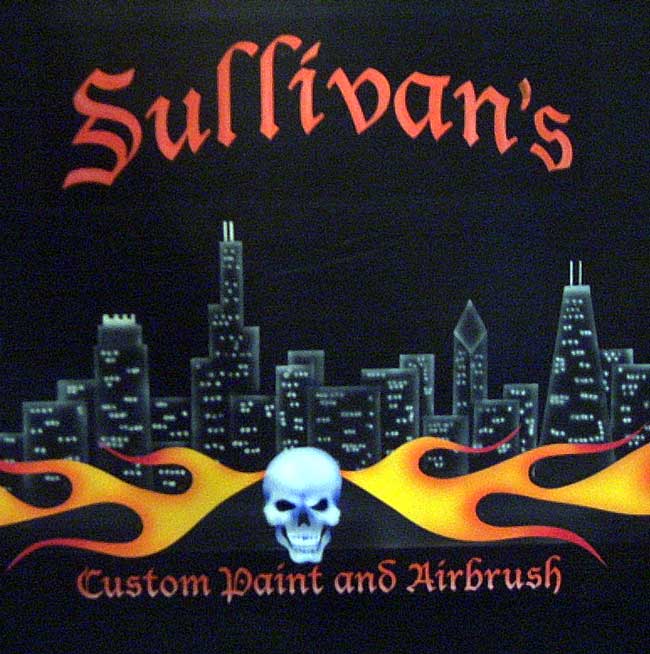 |
Hello there ...here are a couple of pics with your great stencils. Thanks again. Shawn -Shawn does custom motorycycle and car painting. |
...I want to thank you so much for the wonderful "Say What?" stencils. You see I have NEVER stenciled in my life before and I must say I kept putting off doing my project cause I was scared to death. But to my delight the whole project (as simple as it was) turned out beautifully and just took me such a short time. Thank you for doing a great job and having such a great product, so that us dummies can seem creative!-Blessings, Lucy from Wyoming! |
| Here's a photo of the wording I stenciled ... The room...will be be submitted for possible inclusion in a Decorating Den design book...Thanks again for your quick response...you all are a delight to work with and I appreciate your excellent service. Connie Dehnel "Custom stenciling by Connie" Visit her website: Click Here OR email her at customstenciling@verizon.net Manassas, VA 703-331-3519 |
|
 |
I just wanted to send you a picture of how my stencil turned out. It looks FABULOUS! Take a look..... We're Looking, Thanks! |
|
|
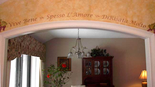 |
Thank you so much for your help with my recent order (Vive Bene~Spesso L'Amore~DiRisata Molto). The arch you calculated was perfect and made my job that much easier. Even more important, the client loved it! I've attached a picture of it, I hope you like the finished project. Thanks again for your time, patience and accuracy. It's always a pleasure to work with you and the Mad Stencilist. With much appreciation, Donna Orsini ~ Mural, Mural on the Wall... Oxford, Connecticut tawk4ever@aol.com |
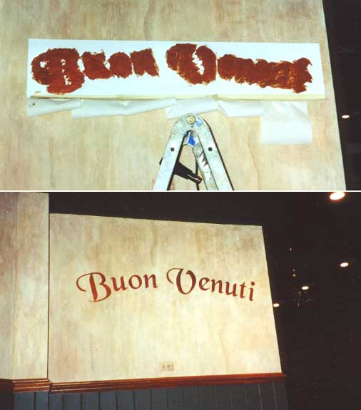
| Mendo Bistro in Ft. Bragg CA. had us do 9 signs they painted inside their windows facing Hwy 1. For this, we needed to cut the stencil backwards. They supplied the font to match their logo. You can visit their web page at mendobistro.com. (Better yet, eat there, the food's delicious!) | 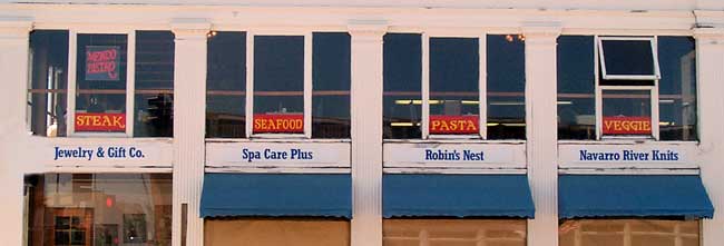 |
This is part of a philanthropic project done by the Golden Poppies, a SALI chapter based in the San Francisco area. They helped refurbish a church in Pleasanton, CA. Thanks to Judy Stellmacher for the photo. Font used: Chancery |
 |
|
Lydia Fernandes, Antelope, CA |

| Hey, Mad Stencilist, Just wanted to tell you how great the custom stencils are! I was searching for an original design for my kitchen and the custom stencil was just the thing. The instructions were easy to follow and the whole project only took an hour. Thanks for providing the tools to make an idea a reality! Keep up the great work! Chamell Burton Cerritos, CA |
 Font used: Brashe |
  Font: Viner |
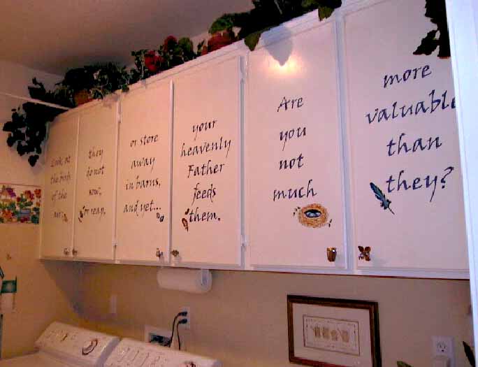
"Attached are the photos of the laundry room which was done with the "Look at the birds..." stencil on 6 cabinets. Hope they come out ok. Sincerely, Debi Haldiman, professional stencilist "wanna be'" ed. note- looks great to me- I think she's there! Nice work with the other motifs. Debbie has done several projects with the lettering- this is her latest. We set this up based on dimensions she sent us for the cabinetry. |
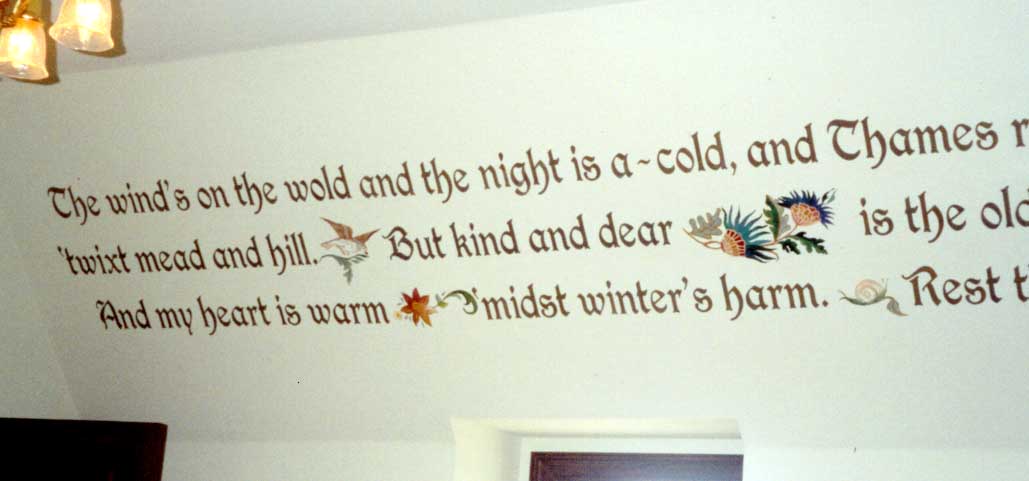  |
| The Wm. Morris poem is up on the walls. Looks WONDERFUL. We did it in a nutmeg brown on light sage walls--then hit it with somemetallic gold; so that it would be wonderful at night with lights. Will send pictures when we have the icing on the cake. Thanks sooo much for all your hard work on this project. MJ. Burrows The hand painted motifs were done by Silver Hennesy, an obviously talented artist from Texas. You can email her at murals@flash.net. Font: Morris |
Contact Us • Home • Embellishments Pre-Made Stencils • SayWhat?™ Custom Made Stencils • About |
| Email HughHoeger@gmail.com • Phone 530 409 8751 (Best to text first) |
All designs are Copyright © Sheri Hoeger or © Hugh Hoeger except where noted. Site Design © 2022 Hugh Hoeger 6/28/2022 |